You have tested the checkout. You put a product in the basket, paid with your own card, and the order arrived in the dashboard. It works. And the analytics still show people reaching the payment step and not finishing, in numbers nobody can explain.
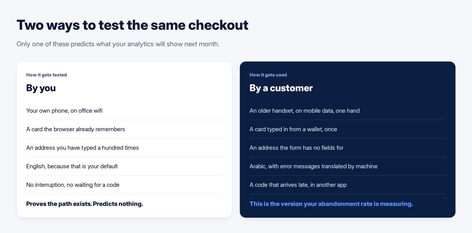
That is the normal state of a Kuwaiti online store, and the reason is structural: you test the path you designed, on your own device, with your own card, on a connection you know. Your customers meet a different checkout. These are the five places it breaks for them and not for you, and how to test for each one in an afternoon.
The number that frames the whole thing
Baymard Institute maintains the standing figure, calculated across fifty separate studies: an average documented cart abandonment rate of 70.22 per cent. Most of that is browsing behaviour and always will be. The part that is yours is the share who intended to buy and were stopped by the form.
The size of that share is measurable in your own data. Compare the number who reach the first checkout screen with the number who complete. If more than about a third fall out between those two points, you are not looking at hesitation, you are looking at friction, and friction is fixable without spending anything on advertising.
It asks for an address that does not exist here
Most ecommerce platforms ship an address form designed elsewhere: street number, street name, city, state, postcode. A Kuwaiti address is a different shape — area, block, street, building, floor, flat — and the postcode field is either meaningless or a box people fill with zeros to get past it.
Google’s own guidance for payment and address forms says the thing plainly: do not force users to squeeze their address into fields that do not fit, and use a single input for phone numbers. That second half matters more than it sounds. A split country-code and number pair is one of the most reliably abandoned inputs on any Gulf checkout, because people paste a number in the format their phone gave them and the form rejects it.
The fix is not clever, it is just work: fields that match how the address is actually written, a free-text line for directions, and a phone field that accepts whatever shape the number arrives in and normalises it afterwards. If deliveries are the business, this is also where the address on the site has to agree with the pin on the map — the same discipline as getting the profile and the location right.
It makes people create an account first
Forcing registration before payment is the oldest known conversion defect and it is still shipped by default on many builds. Nielsen Norman Group’s position after repeated testing is blunt: forcing registration causes lost sales, and sites that add guest checkout commonly see an immediate increase.
The argument against guest checkout is always that you lose the customer record. You do not. You capture the same email and phone in the order, and you offer the account afterwards, when the person has already got what they came for and the request is reasonable. What you lose by insisting is the first-time buyer who does not yet trust you enough to make a password.
The step you do not control, and must design around
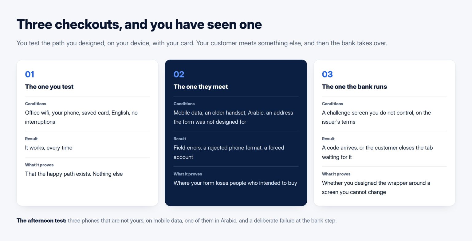
After your form ends, the card issuer takes over. Under the EMV 3-D Secure model, low-risk transactions run frictionless while higher-risk ones trigger a challenge — a one-time passcode, a knowledge question or a biometric check. That challenge is the bank’s screen, not yours, and it is where a large share of Kuwaiti checkout failures happen.
You cannot change the screen. You can change everything around it. Tell the customer, before they press pay, that a code will arrive by message and that they should not close the window. Keep the browser tab intact rather than redirecting through something that loses state. Never clear the basket while the payment is pending. And make sure a failed authentication returns them to a page that offers to try again with the details still filled in, rather than to a bare error.
That last point is not only usability. The accessibility standard most procurement processes now reference requires, for financial transactions specifically, that a submission is either reversible, checked for input errors, or confirmable before it is final. A checkout that dead-ends on a failed authentication meets none of the three.
The errors do not tell anyone what to do
Watch what your checkout says when something is wrong. If the message is a red line at the top of the page saying an error occurred, the customer has three options: guess, start again, or leave. Most leave.
Nielsen Norman Group’s form guidance is specific about the mechanic: keep the error message next to the field it belongs to, and avoid tooltips, which users may never see. Every message should name the field, say what is wrong with it, and say what a correct value looks like. Write them in both languages, and read the Arabic ones aloud — machine-translated error text is where bilingual stores lose people silently.
It has never been used on a phone that is not yours
Baymard’s measurement of real flows found that the average checkout runs 5.1 steps and 11.3 form fields, where most sites need about eight. Every field above what is necessary is a chance to stop, and on a phone each one is a keyboard change, a dropdown, and a moment of doubt. The gap between eleven and eight is three fields, which sounds trivial and is not: it is three more opportunities to mistype, three more validation rules that can fire wrongly, and three more seconds of a person deciding whether this is worth it.
So count your fields and delete the ones you do not act on. Company name on a consumer store. Address line two. A separate confirm-email box. Anything you have never once used to fulfil an order is costing you orders.
The afternoon test
Take three phones that are not yours — a colleague’s, a family member’s, an older handset — and run a real purchase on each, on mobile data rather than office wifi, in Arabic on at least one of them. Pay with a card that is not the one you always use. Then, deliberately, fail: enter a wrong code at the bank step, and see where you land.
Write down every moment somebody had to think, and every screen that did not say what to do next. That list, in order, is your work queue, and it will be shorter and cheaper than the redesign anyone will try to sell you.
None of this touches the approval side of taking payments, which is a separate project with its own document list — that is what KNET actually requires before your store can take a payment. This post assumes you already passed that and are still losing people, which is the more common and more expensive situation. If the underlying build is the constraint rather than the form, that shows up as the difference described in what design covers and what development covers, and it belongs in the brief before the store gets built rather than after.
If the checkout needs rebuilding rather than patching, my company builds stores on WooCommerce for exactly these reasons: WooCommerce stores at Tothiq.
Frequently asked questions
Our platform will not let us change the address fields. What then?
Most platforms allow more than the default suggests, either through settings or a small extension, and it is worth asking specifically rather than accepting the first answer. Where it genuinely cannot be changed, the practical mitigation is a clearly labelled free-text line for directions and a note that the postcode may be left as zeros. It is a workaround rather than a fix, and it is worth logging as a reason to reconsider the platform at the next renewal.
How do we know whether people are failing at the bank step or ours?
Your payment provider’s dashboard separates them, and it is the first place to look rather than your website analytics. Attempted transactions that were declined or abandoned at authentication appear there with a reason code. Compare that count with the number who reached your payment button. The gap between the two is yours; the failures after it are the bank’s, and your job with those is the wrapper around the screen rather than the screen.
Should we offer cash on delivery?
It removes the entire class of failure described here, and it introduces different costs: failed deliveries, cash handling, and a higher rate of orders that change their mind at the door. For most Kuwaiti stores the answer is to offer both and watch the split, because the ratio tells you how much your checkout is actually costing you. If a large majority chooses cash, that is not a payment preference, that is a verdict on the online payment experience.
Is a one-page checkout better than a multi-step one?
Neither is better in principle; the field count and the clarity matter far more than the layout. A single page with fifteen fields is worse than three steps with eight. What multi-step does well is show progress, which reduces the feeling of an endless form on a phone. What it does badly is lose people between steps if each one reloads slowly. Pick whichever your platform does properly rather than switching on principle.
How much can we realistically expect to recover?
Do not budget against a published uplift figure, because the published figures come from sites with different starting points. Measure your own drop between the first checkout screen and completion, fix the specific things on your list, and measure again after a month. The honest expectation for a store that has never had this pass done is a meaningful improvement from removing fields and fixing error messages alone, before anything is redesigned.